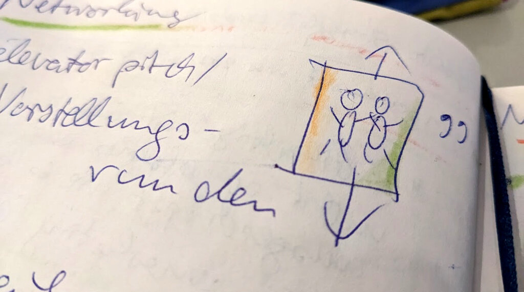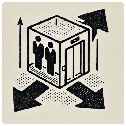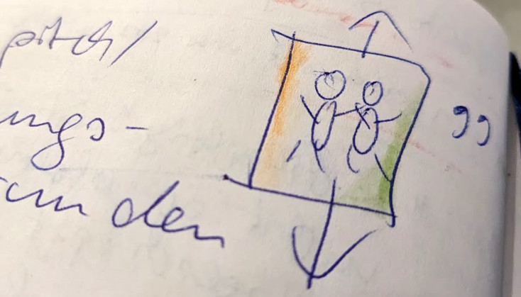
I asked an “artificial intelligence” (DALLE from Open AI via ChatGPT) to draw exactly what I described in the alternative text. It produced a beautiful picture with the retro aesthetic of a historical nonfiction book — it could almost be a lithograph.
The arrows do point up and down, but I never actually said that there shouldn’t be three.
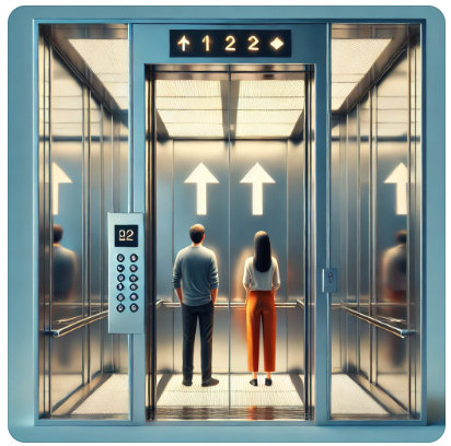
If I ask for a drawing in English in more concise words, the typical surreal high-gloss aesthetic with an Uncanny Valley effect appears, which we can see all too often as an illustration of uninspired blog posts.
Looking at all three approaches side by side, it becomes obvious that the different AI-generated graphics still share some similarities that distinguish them from the photograph of the hand-painted sketch in my notebook. But if it were just about aesthetics, we could ask the AI to produce the desired look:
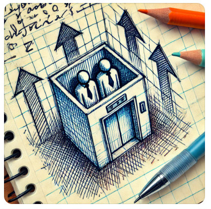
Please produce a hand-drawn sketch of two figures in a box with arrows pointing upwards and downwards as a symbolic drawing about elevator pitches. The sketch should look spontaneous and imperfect, like in a notebook, where the writing on the back of the book shows through slightly. It should look like it was quickly drawn with a blue ballpoint pen and shaded with colored pencils in orange and light green at the edges.
I had not expected that “a picture shaded with colored pencils” could be misunderstood in this sense. But that’s not the only problem.
The concoction that ChatGPT cheekily presents to me as the supposedly desired result with the words “perfect for your elevator pitch notes,” I have already exhausted my free image creation budget for today. Thankfully! No more digital horror, back to manual work!
Where did the down arrows go? Why has the box become an elevator, and why are the two people wearing ties?
Apart from the general disadvantages of today’s artificial intelligence, such as wasted energy and fake news, AI has a legitimate right to exist as a new tool, just as photography became an art form in its own right and not a mere replacement for painting.
Clichéd imagery
But the images generated by amateurs with AI are dangerous in another way: clichés, prejudices and stereotyping – problems for which the art form of comics has often been rightly criticized.
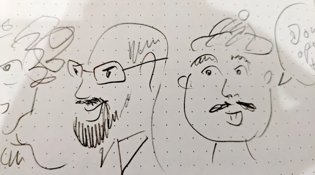
When we draw ourselves, we can consciously use clichés and simplify them in a way that makes sense, at least to us. That’s good enough for our own notes. The principle of simplification and the courage to draw with a child’s eye is also known as “pragmatic sketching”, as I learned at a lecture by the Berlin-bassed designer Eva-Lotta Lamm (“The joy of doing ugly sketchnotes”). My sketch for the elevator pitch is such a pragmatic one. Perhaps the following caricatures of fictitious people are, too, because I have captured some features in a very short time that I noticed and that are not difficult for me to draw: glasses, beards, caps, and a rough idea of eyes, facial expressions, and head shapes.
However, my focus on easy-to-draw accessories falls short of the moment’s essence by emphasizing irrelevant details while missing critical things I thought about but didn’t draw and wouldn’t put into words when writing a picture description. Likewise, elevator doors, arrows, colors, and clothing details distract from an essential aspect missing from all the images shown, including my original sketch: the point isn’t using an elevator together but about the limited time for contact and communication. The term “elevator pitch” is just as linguistically misleading as these drawings.
If our own drawing skills are not good enough, do we really think we can describe pictures better with words?
Gaining knowledge through mistakes
However, there is an opportunity to gain knowledge here. To publish accessible content, all images should be described with a so-called alt text. Its actual degree of helpfulness for someone who has never seen the image remains questionable. Misinterpretations of artificial intelligence can show us what our texts are still missing. But we could also have asked a human! Reviewing our drawings within a few months or years’ distance can be fun and informative. I sketched some people who gave lectures or introduced themselves to me at networking events. Working in a male-dominated industry, I quickly created a gallery of faces with glasses and beards that all looked quite similar. How would I have sketched the same people differently to make them more distinctive? How can this change my perception?
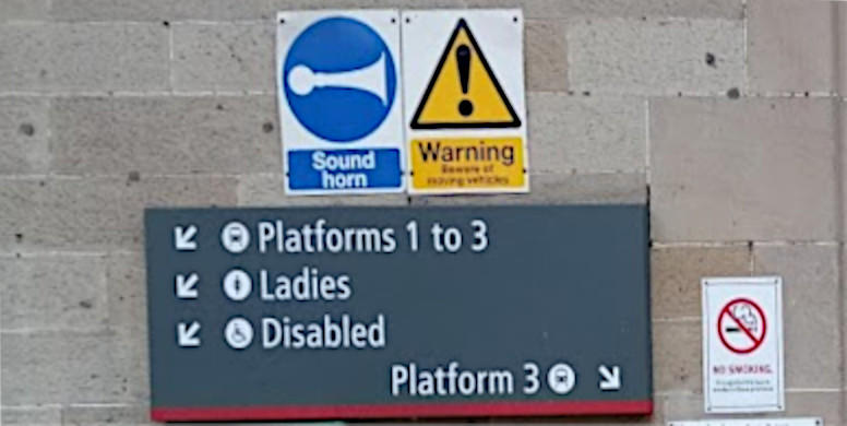
Should I have used faces, speech bubbles, a clock, or a digital display of remaining time to symbolize the short time frame of an “elevator pitch”? Or would my awkward fingers have turned this into an unsolvable picture puzzle? The pragmatic sketch of the stick figures in the elevator box at least helps me to find the corresponding page quickly when leafing through my notebook, similar to how pictograms are often recognizable enough to navigate but usually remain incomprehensible without context, like these signs with symbols at a British train station, which apparently don’t seem to work without additional text description.
Draw!
Conclusion: take notes, write and draw! Make up your own mind about generative AI, but please stop decorating blogs and websites with nonpersonal glossy pictures!
